Wednesday, June 17, 2009
Tuesday, June 16, 2009
Monday, June 8, 2009
Eclectic design and style
So if I was not such a BBW I would soooo be very much more strange, odd and extremely eclectic in my own scene of fashion.
Sure I dig mainstream but I also like to mix in things that stand out a tad more.
So anyway while I was looking for real life inspiration for the design and dress of my steampunk charter I came across these really neat and yes odd pants that are sweeping the underground fashion trends in the East and West.
I give you the "Tobi" pants sometimes called 'SteepleJacks'.
What are tobi though? well to quote Lastwear they are:
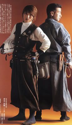
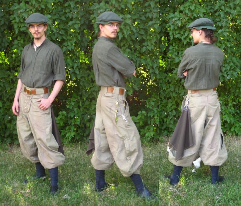
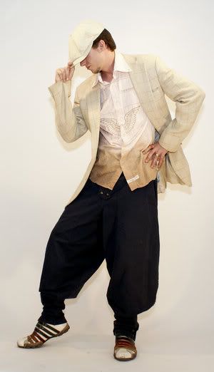
"....the Steeplejacks are based on the style of pants worn by Japanese construction workers known as Tobi pants."
Such as in this picture:
From this there has steamed a moment that is touching the niche markets and the hip trend setting waves of people (ya know the people that start the trends and fads or such).
Some examples are as fallows:
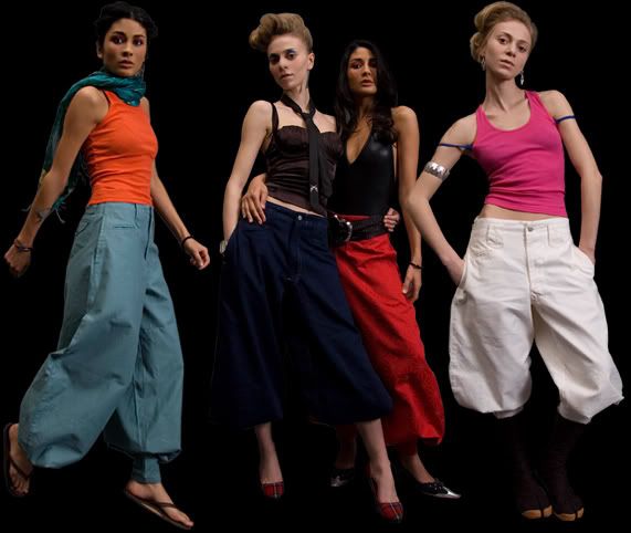
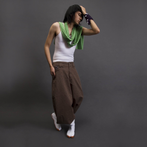
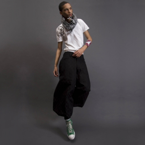
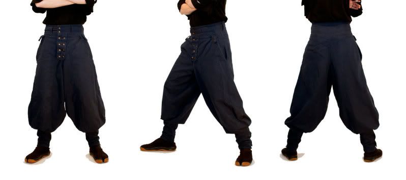
These are from a hip trendy shop called Shigoto.
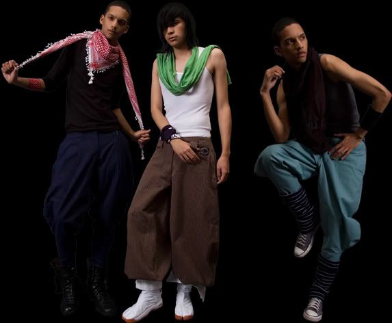
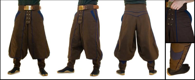
These are less modern in their design but still none the less cool! Less baggy to compared to the hip version. Made by a guy called Marcus Stratus aka Weerd on DA or also he has a Etsy shop.
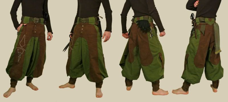
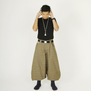
Weerd got the pattern for the pants from Lastwear Though he changed it a lil bit. Lastwear is in between what Weerd does and the hipsters in that they maintain more of the original design but also try and make then a tad more modern as well.
So what do you think? I love them and if I had the $150 to commission some from either Marcus or the Lastwear crew I would. Or the wallet biting $210-352 from Shigoto. But that is like buying name brand from places like Abercrombie & Fitch. OUCH!
Oh well. I still dig these awesome and yes eclectic pants!
Sure I dig mainstream but I also like to mix in things that stand out a tad more.
So anyway while I was looking for real life inspiration for the design and dress of my steampunk charter I came across these really neat and yes odd pants that are sweeping the underground fashion trends in the East and West.
I give you the "Tobi" pants sometimes called 'SteepleJacks'.
What are tobi though? well to quote Lastwear they are:
Such as in this picture:
From this there has steamed a moment that is touching the niche markets and the hip trend setting waves of people (ya know the people that start the trends and fads or such).
Some examples are as fallows:
These are from a hip trendy shop called Shigoto.
These are less modern in their design but still none the less cool! Less baggy to compared to the hip version. Made by a guy called Marcus Stratus aka Weerd on DA or also he has a Etsy shop.
Weerd got the pattern for the pants from Lastwear Though he changed it a lil bit. Lastwear is in between what Weerd does and the hipsters in that they maintain more of the original design but also try and make then a tad more modern as well.
So what do you think? I love them and if I had the $150 to commission some from either Marcus or the Lastwear crew I would. Or the wallet biting $210-352 from Shigoto. But that is like buying name brand from places like Abercrombie & Fitch. OUCH!
Oh well. I still dig these awesome and yes eclectic pants!
Thursday, May 28, 2009
Photos
So here are some of the downtown photos that I've been messing with. I have more that I want to do but that is neither here nor there.
Tell me what you think.
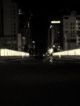
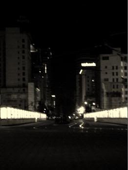
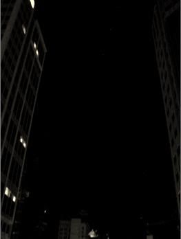
I really do enjoy black and white photo work.
Tell me what you think.
I really do enjoy black and white photo work.
Thursday, May 21, 2009
Patch Poll 3.0 - Plz vote or comment!
So here I am again looking for some opinions on my patch WIPs and now the placement of the UCI and how you like the text I have chosen or if you have another that you think would work better.
Remember this is suppose to be a Steampunk-ish designed patch. And is suppose to have the feel of an olde (yep old with a 'e' if ya know what I mean) map or parchment or a book.
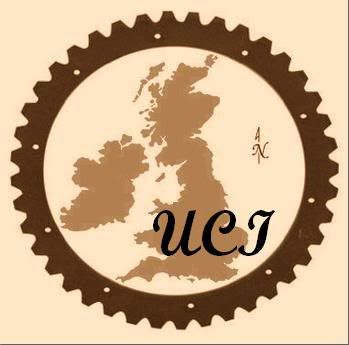
First up is the idea that sprang from my head and after working up the patch and trying this element out I just today decided that it was not going to work. Its a little bit to modern and doesn't meld well with the patches. I might try to fool around with it more free hand with pencil and try to get it working better with the new font and design. ...but for now it is scrapped pending a re-engineering (with similar format that is).
Am I the only one that feels that the above is similar to what a University emblem would look like? Hmmm.... I think it is. Thus to modern. *le sigh* I really like this idea. Oh well.
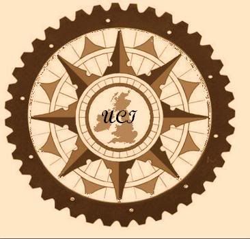
On to some examples of the final patches and the wording on them. Remember that the circle ones are going to be a circle patch (just on square 'paper' for ease of working with them). The half circle one will be a rectangle patch.
Design one (1) examples:
A simple design which would work well transiting to a patch.
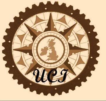
Design two (2) examples:
More complex and I just like this one more. Very eye grabbing in my POV. (Yes Craig I know you think that is it to complex but I will try it anyway and see what the company says lol.)
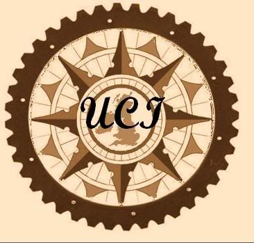
Design three (3) examples:
The half patch or rectangular patch. Kinda fun might be made side project while working with the full ones. I dunno if I will get this done but might in the future but vote on it any way plz.

^ALL THE DESIGNS ABOVE ARE JUST EXAMPLES OF THE TEXT PLACEMENT^
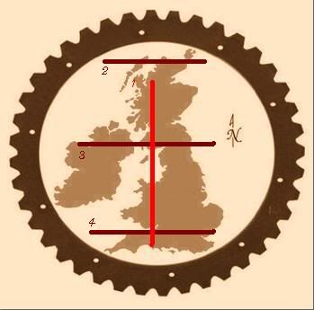
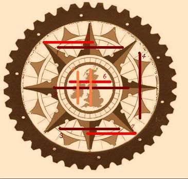
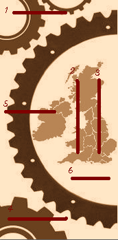
Now onto the text placement options. I have lines in red shades place on the WIP patches with numbers next to the line. I would like you to give me the patch you like and the number line that you think the text would look good on.
EXAMPLE: I like patch 'A' and line 3!
If there is not a line on the place that you think the text looks best then say something like:
...I think it the text would work best and look good next to line 3!
Patch 'A'
Patch 'B'
Patch 'C'
Like last time plz leave comments on your ideas or your rants. All verbiage is going in to see how these are received and in working to improve them more.
Yes I'm odd, we have established this as well as my never growing up ^_^ MUHAHAHAHAHAHAHAHA!
Yay and your done (...if you voted or commented that is >.>)!
Remember this is suppose to be a Steampunk-ish designed patch. And is suppose to have the feel of an olde (yep old with a 'e' if ya know what I mean) map or parchment or a book.
First up is the idea that sprang from my head and after working up the patch and trying this element out I just today decided that it was not going to work. Its a little bit to modern and doesn't meld well with the patches. I might try to fool around with it more free hand with pencil and try to get it working better with the new font and design. ...but for now it is scrapped pending a re-engineering (with similar format that is).
Am I the only one that feels that the above is similar to what a University emblem would look like? Hmmm.... I think it is. Thus to modern. *le sigh* I really like this idea. Oh well.
On to some examples of the final patches and the wording on them. Remember that the circle ones are going to be a circle patch (just on square 'paper' for ease of working with them). The half circle one will be a rectangle patch.
A simple design which would work well transiting to a patch.
More complex and I just like this one more. Very eye grabbing in my POV. (Yes Craig I know you think that is it to complex but I will try it anyway and see what the company says lol.)
The half patch or rectangular patch. Kinda fun might be made side project while working with the full ones. I dunno if I will get this done but might in the future but vote on it any way plz.
Now onto the text placement options. I have lines in red shades place on the WIP patches with numbers next to the line. I would like you to give me the patch you like and the number line that you think the text would look good on.
EXAMPLE: I like patch 'A' and line 3!
If there is not a line on the place that you think the text looks best then say something like:
...I think it the text would work best and look good next to line 3!
Patch 'A'
Patch 'B'
Patch 'C'
Like last time plz leave comments on your ideas or your rants. All verbiage is going in to see how these are received and in working to improve them more.
Yes I'm odd, we have established this as well as my never growing up ^_^ MUHAHAHAHAHAHAHAHA!
Yay and your done (...if you voted or commented that is >.>)!
Subscribe to:
Posts (Atom)